A Guide to Understanding the CSS Box Model
Introduction
The CSS Box Model is the foundation of layout design in web development. Understanding its principles is essential for creating well-structured web pages.
In this guide, we’ll look at the components of the CSS Box Model, and how it influences the layout and styling of elements on a webpage.
What is the CSS Box Model?
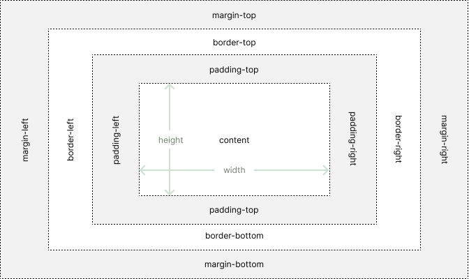
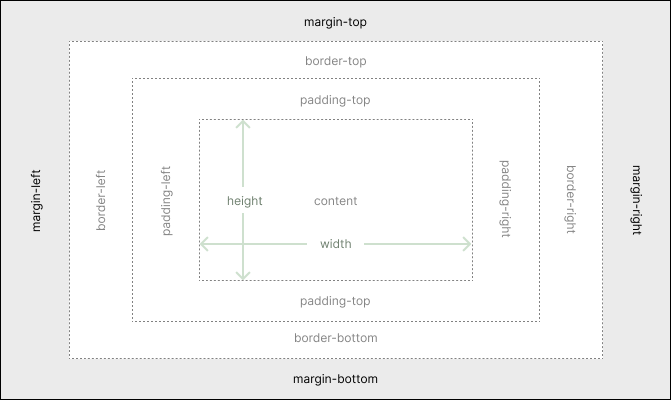
At its core, the CSS Box Model conceptualizes HTML elements as rectangular boxes. Each box comprises four main components:
1. Content
The actual content of the element, such as text, images, or other HTML elements.
2. Padding
A transparent area surrounding the content, providing space between the content and the border.
3. Border
A visible or invisible boundary surrounding the padding and content, defining the element’s edges.
The Border property is typically used for styling, and not for placement.
4. Margin
A transparent area outside the border, used for creating space between adjacent elements.
Understanding Each Component
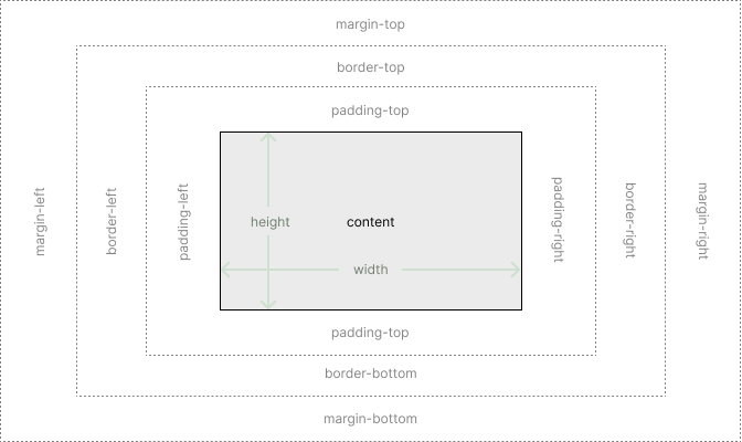
1. Content Area
- The content area is determined by the
widthandheightproperties specified in CSS or the intrinsic dimensions of the content. - It is where the actual content of the element is displayed.
- Using
widthandheightwill only affect the dimensions of the content area, addingpadding,border, ormarginwill increase the the dimensions beyond what was set bywidthandheight.
/* giving the .box element a specific value */
.box{
    height:200px;
    width:300px;
}

/* giving the .box element a minimum height */
.box{
    min-height: 400px;
}

/* giving the .box element a maximum width */
.box{
    max-width: 150px;
}
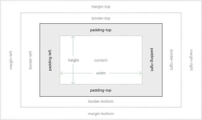
2. Padding
- Padding adds space around the content area inside the border.
- It can be adjusted using the
paddingproperty in CSS, which accepts values in pixels, percentages, or other units.
The padding property.
.box{
    padding-top: 1px;
    padding-left: 2px;
    padding-bottom: 3px;
    padding-right: 4px;
}
These individual properties can also be written on a single line padding: [top] [left] [bottom] [right].
For example, the following code would be the same as the above:
/* shorthand for all 4 sides */
.box{
    padding: 1px 2px 3px 4px;
}
The shorthand can be further simplified if both the top and bottom are the same, and the left and right are the same.
padding: [top+bottom] [left+right]
/* top and bottom will have 1px padding
   and left and right will have 2px padding */
.box{
    padding: 1px 2px;
}
You can also control only the top and bottom values using padding-block: [top] [bottom].
/* padding top of 1px and bottom of 2px */
.box{
    padding-block: 1px 2px;
}

/* padding top and bottom of 1px */
.box{
    padding-block: 1px;
}
This is the same for left and right using padding-inline: [left] [right]
/* padding left of 3px and right of 4px */
.box{
    padding-inline: 3px 4px;
}

/* padding left and right of 3px */
.box{
    padding-inline: 3px;
}
Background Color
Using CSS to change the background color of an element ( for example: background-color:red) will affect the background of the Content Area as well as the Padding.
padding and margin do not have css properties that change the color.
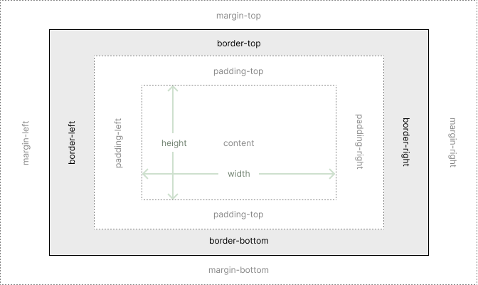
3. Border
- The border surrounds the padding and content area, providing a visible or invisible boundary.
- Borders can be styled, colored, and customized using CSS properties like
border-width,border-style, andborder-color.
The following will give the .box element a red dashed border that is 4px in width.
.box{
    border-width: 4px;
    border-style: dashed;
    border-color: red;
}
The border properties can also be written as border: [width] [style] [color].
.box{
    border: 4px dashed red;
}
You can also use CSS to change each side.
.box{
    border-left-width: 2px;
    border-left-style: dotted;
    border-left-color: green;
}
Which can also be written on a single line.
.box{
    border-left: 2px dotted green;
}
4. Margin
- Margins create space between the element’s border and adjacent elements.
- They can be adjusted using the
marginproperty in CSS, controlling the spacing between elements.
The margin property, has the same property styles as padding.
.box{
    margin-top: 1px;
    margin-left: 2px;
    margin-bottom: 3px;
    margin-right: 4px;
}
These individual properties can also be written on a single line margin: [top] [left] [bottom] [right].
For example, the following code would be the same as the above:
/* shorthand for all 4 sides */
.box{
    margin: 1px 2px 3px 4px;
}
You can also go further and control only the top and bottom values margin-block: [top] [bottom].
.box{
    margin-block: 1px 2px;
}
Or, by using only 1 value affect both top and bottom:
.box{
    margin-block: 1px;
}
This is the same for left and right using margin-inline: [left] [right]
.box{
    margin-inline: 3px 4px;
}
or
.box{
    margin-inline: 3px;
}
A common usage for margin-inline property, is to center an element on a page using the auto value.
.box{
    width:42rem;
    margin-inline:auto;
}
Try It!
Try changing the value of padding-top of the .box element to 100px. And then play around with the other properties.
In this example you should notice how the Box Model of the <div class="box"></div> affects the Box Model of the <p></p> element.
On Page Example
Inspect the pink box and the light blue box in your browser inspector.
Try playing with the values, and even adding your own margin, border, and padding.
Impact on Layout and Design
Understanding the CSS Box Model is crucial for creating effective layouts and designs:
- Spacing and Alignment: By manipulating padding and margin properties, developers can control the spacing between elements and achieve proper alignment.
- Responsive Design: The Box Model is vital in responsive design, allowing for the arrangement of elements, based on size and spacing for different screen sizes.
- Border and Background Styling: Borders and padding contribute to the visual appearance of elements, enabling designers to create visually appealing layouts.
- Box Sizing: CSS introduces the box-sizing property, which controls how the width and height of elements are calculated, considering or ignoring padding and borders.
Conclusion
The CSS Box Model forms the backbone of modern web layout and design. By mastering its principles and understanding how each component contributes to the overall layout, developers and designers can create visually stunning and well-structured web pages. Embracing the versatility of the CSS Box Model allows web developers to craft responsive and accessible layouts across various devices and screen sizes.